
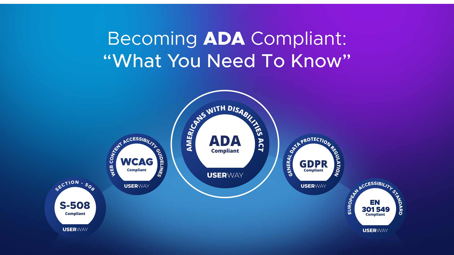
The Americans with Disabilities Act (ADA), along with WCAG (Web Content Accessibility Guidelines), ensures digital spaces are usable by everyone—including people with visual, auditory, motor, and cognitive impairments. This checklist will help you meet those standards with confidence.
Use Semantic HTML (Structure and Meaning)
Why it matters: Screen readers rely on HTML elements to interpret the structure of a page.
What to do:
Use <header>, <main>, <nav>, <footer>, and <section> to organize content meaningfully.
Headings (<h1> to <h6>) should follow a logical order. Don’t skip levels (e.g., jumping from <h1> to <h3>).
Avoid using <div> and <span> for things that have semantic meaning, like buttons or links.
Pro Tip: Use a heading outline checker or browser extension to visualize the structure.
Provide Text Alternatives for Non-Text Content
Why it matters: People using screen readers can’t see images or videos, so descriptive alternatives are crucial.
What to do:
Use alt text to describe the purpose of images (e.g., “Headshot of Jane Doe”).
For purely decorative images, use alt=”” so screen readers skip them.
Complex visuals like charts need longer descriptions, ideally in nearby text or linked descriptions.
Avoid: Vague alt text like “image1.jpg” or “graphic”—this isn’t helpful.
Ensure Full Keyboard Accessibility
Why it matters: Many users rely on a keyboard alone (e.g., users with motor disabilities or screen reader users).
What to do:
Test site navigation using only Tab, Enter, and arrow keys.
Use visible :focus styles to indicate where the user is on the page.
Custom components (e.g., modals, dropdowns) must be operable with the keyboard.
Avoid elements that trap keyboard focus (like improperly coded modals or menus).
Tools: Use Chrome DevTools Accessibility panel to test focus and tab order.
Maintain Sufficient Color Contrast
Why it matters: Low contrast makes text unreadable for users with low vision or color blindness.
What to do:
Ensure a contrast ratio of at least 4.5:1 for normal text, 3:1 for large text (18px bold or 24px regular).
Use contrast checkers (e.g., WebAIM Contrast Checker) to test combinations.
Avoid using color alone to indicate important messages (e.g., red = error). Add icons or text labels too.
Good practice: Provide a colorblind-friendly palette from the start of your design system.
Use ARIA Roles and Landmarks Responsibly
Why it matters: ARIA enhances accessibility where semantic HTML falls short—but misuse can decrease accessibility.
What to do:
Use ARIA only if no semantic HTML element is available.
Common roles:
role=”button” (for custom buttons)
aria-expanded=”true” (for toggles/dropdowns)
aria-label, aria-labelledby, and aria-describedby (for labeling elements)
Caution: Never replace native elements (like <button>) with <div role=”button”> unless absolutely necessary.
Label Forms Clearly and Programmatically
Why it matters: Users must understand what each input field is for, especially with screen readers.
What to do:
Every <input> should have a corresponding <label> with for=”input-id”.
Use placeholder text only as hints—not as a replacement for labels.
Use aria-describedby to reference hints or error messages by id.
Also include:
Required field indicators
Clear validation messages
Helpful default values (if appropriate)
Provide Captions and Transcripts for Multimedia
Why it matters: Deaf or hard-of-hearing users need text equivalents of audio content.
What to do:
Add captions to all videos—real-time or pre-recorded.
Provide transcripts for podcasts or audio-only content.
Use accessible video players that support keyboard and screen reader navigation.
Resources: Use tools like YouTube’s auto-caption editor or Descript for transcription and captioning.
Design for Zoom & Responsive Scaling
Why it matters: Users may zoom in up to 200% to read or interact with content.
What to do:
Use fluid layouts with relative units (em, rem, %, vh/vw) instead of fixed px.
Avoid horizontal scrolling at 200% zoom.
Ensure buttons, inputs, and text do not overlap or become inaccessible.
Test: Manually zoom in via browser settings and ensure all functions remain usable.
Help Users Recover from Errors
Why it matters: Input mistakes should be easy to identify and fix, especially in forms.
What to do:
-
Highlight fields with errors clearly, using more than just color (e.g., red border + message).
-
Provide clear instructions and suggestions for correcting the input.
-
Use ARIA live regions (aria-live=”assertive”) to announce validation messages dynamically.
Bonus Tip: Validate on blur and submission, not while the user is still typing.
Test with Real Tools and Users
Why it matters: Automated tools catch ~30% of issues. Manual testing is essential.
Automated Tools:
-
axe DevTools (browser extension)
-
WAVE Web Accessibility Evaluation Tool
-
Google Lighthouse (in Chrome DevTools)
Manual Testing:
-
Navigate using only a keyboard.
-
Use a screen reader:
-
NVDA (Windows, free)
-
VoiceOver (macOS/iOS)
-
JAWS (Windows, paid)
-
User Testing: When possible, involve users with disabilities for feedback.
Final Words: Make Accessibility Part of Your Design Culture
Accessibility isn’t a checkbox—it’s an ongoing mindset. If you need professional help in making your website compliant, please fill out the contact form.
We are here to help you. Let’s make the web a more inclusive place—together.